
🌍 Why World Bank Data?
The World Bank provides high-quality, globally recognized data
across multiple sectors—finance, agriculture, health, education, energy, and
environment. For analysts, it’s a goldmine of information that can be
transformed into actionable insights with Power BI.
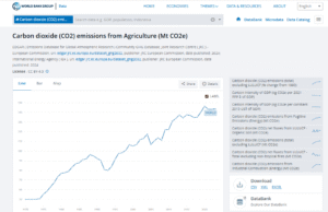
In this example, we’ll focus on the CO₂ emissions from
agriculture (measured in metric tons of CO₂ equivalent). This indicator
helps policymakers, researchers, and analysts understand how agriculture
contributes to greenhouse gas emissions worldwide.
📊 Using My Power BI Template
To save you time, I’ve already built a Power BI template for
the World Bank CO₂ emissions dataset. With this template, you can:
· Select countries or regions
from a slicer.
· Explore trends over time
(1970–2023).
· Compare countries on a map
visualization.
· See detailed year-by-year data
in a clean table.
This template is designed with modern visuals, user-friendly
slicers, and interactive charts—so you can focus on insights rather than
setup.
🎥 Step-by-Step Video Guide
I’ve recorded a step-by-step video where I explain exactly
how to:
1. Download the World Bank
dataset.
2. Copy the Location of downloaded CSV file from Wordback after extraction
3. Load and use my pre-built
template.
4. Customize the visuals for your
own analysis.
👉 Watch the
tutorial video here
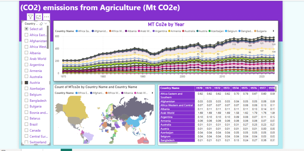
📈 Example Dashboard
Here’s an example of what the dashboard looks like:
· Line Chart: MT CO₂e by year across selected countries.
· Map Visualization: Country-level comparison of emissions.
· Table: Historical dataset in a user-friendly format.
🚀 Why Use This Template?
· Saves you hours of setup time.
· Built with Power BI best
practices (clean visuals, consistent formatting).
· Ready for business,
academic, or research presentations.
· Easy to expand—add your own
KPIs or merge with other datasets.
📬 Want Custom Power BI Solutions?
If you need custom dashboards, KPIs, or advanced Power BI
development, I’d be happy to help:
📌 LinkedIn: Jamil Ahmad
📌 WhatsApp: +92 305 6645202
I specialize in building interactive data solutions across
industries like sales, healthcare, energy, and finance.
✅ Takeaway: With World Bank data and my Power BI template,
you can quickly visualize complex datasets and make data-driven decisions.
Start with agricultural CO₂ emissions—or expand into other datasets the World
Bank provides.
Would you like me to also design a call-to-action banner
(like “Download Template” or “Hire Me for Custom Power BI Solutions”) that you
can embed at the bottom of your blog post?
Leave a Reply to RaymondBeaut Cancel reply