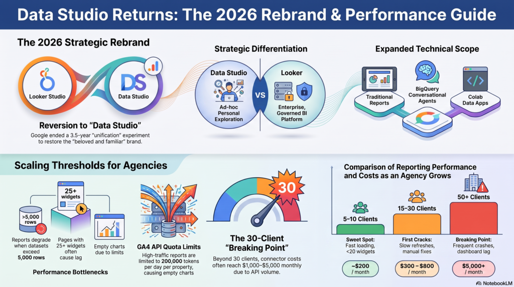
Google’s U-Turn: Why Looker Studio is Data Studio Again (and the Real Cost of “Free”)

On April 11, 2026, Google executed a surprising strategic reversal that signaled the end of a long-standing identity crisis in the analytics world: it officially retired the “Looker Studio” brand and reintroduced the “Data Studio” name. This move marks the conclusion of a 3.5-year experiment in product unification that began in October 2022. For users […]

Google’s U-Turn: Why Looker Studio is Data Studio Again (and the Real Cost of “Free”) Read More »

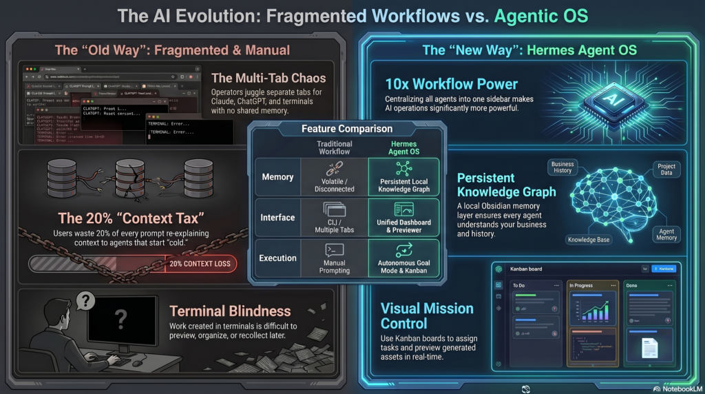
How Hermes Agent Can Transform a Data Analyst’s Workflow

Artificial Intelligence is rapidly changing how data analysts work. While most professionals are familiar with tools like Power BI, Python, SQL, and Excel, a new category of AI tools is emerging: autonomous AI agents. One of the most interesting developments in this space is Hermes Agent, an open-source AI agent developed by Nous Research. Unlike

How Hermes Agent Can Transform a Data Analyst’s Workflow Read More »

How to Visualize World Bank Data in Power BI (Agricultural CO₂ Emissions)

If you’re working with World Bank datasets, Power BI is one of the most powerful tools you can use to bring that data to life. In this guide, I’ll walk you through how to visualize Agricultural CO₂ emissions (EN.GHG.CO2.AG.MT.CE.AR5) data from the World Bank using a ready-made Power BI template that I’ve developed.   🌍

How to Visualize World Bank Data in Power BI (Agricultural CO₂ Emissions) Read More »

How I built a polished Healthcare Analytics dashboard (Figma + Power BI) — step-by-step

Intro (TL;DR)I built a modern Healthcare Analytics dashboard (public healthcare data) using Power BI for visuals and Figma for background design. In this post I’ll show exactly how I prepared the data, built the report, styled the UI in Figma, exported two image variants (with and without background), and produced a mockup for sharing. If

How I built a polished Healthcare Analytics dashboard (Figma + Power BI) — step-by-step Read More »

How to Plan a Dashboard as a Business Owner: A Step-by-Step Guide

In today’s data-driven world, dashboards are essential tools for business owners who want to make informed decisions quickly. But before you dive into building one, it’s important to plan it carefully to ensure that it actually helps you achieve your goals. In this blog post, we’ll walk through a simple, effective process to plan a

How to Plan a Dashboard as a Business Owner: A Step-by-Step Guide Read More »

How to Connect JotForm with Power BI for Responses Visualization 2025

IntroductionHello! I’m Jamil Ahmad, a Business Intelligence (BI) consultant from Pakistan, working with clients worldwide via Upwork. If you’re looking for a way to seamlessly connect JotForm submissions to Power BI and visualize your survey responses, you’re in the right place! This guide will show you step-by-step methods to make your data speak through stunning

How to Connect JotForm with Power BI for Responses Visualization 2025 Read More »

How I Achieved “Data Analysis with Python” by IBM on Coursera

Hello! My name is Jamil Ahmad, and I am a freelance Data Analyst with a Master’s degree in Economics, living in Pakistan. Over the past few years, I have worked on Upwork as a Top-Rated freelancer, helping clients worldwide with data analysis and visualization. Today, I want to share my journey of completing the prestigious

How I Achieved “Data Analysis with Python” by IBM on Coursera Read More »