Category: Blog
Insights from Healthcare Data: Trends, Patterns, and Demographic Analysis Case Study
Introduction to Healthcare Dataset Analysis Case Study 001 Welcome to this comprehensive guide on analyzing a synthetic healthcare dataset. This dataset has been meticulously crafted to simulate real-world healthcare data, making it an invaluable resource for data science, machine learning, and data analysis enthusiasts. Whether you are a seasoned professional or a budding analyst, this…
How to Create a Demand and Supply Chart in Excel
Demand Curve in Excel Supply Curve in Excel Description of the Chart: The demand and supply chart illustrates the relationship between the price of a product or service and the quantity demanded and supplied in a market. In this chart, the demand curve represents the quantity of a good or service that consumers are willing…
SQL Practice Question/Answers 2025
3 most profitable companies Find the 3 most profitable companies in the entire world. Output the result along with the corresponding company name. Sort the result based on profits in descending order. Soucrs Dataframe: forbes_global_2010_2014 Case# 2 Finding Doctors Find doctors with the last name of ‘Johnson’ in the employee list. The output should contain…
Discount Calculator 2025
Discount Calculator Discount Calculator Price before discount: Select discount type: Discount PercentagePrice After Discount Discount (%): Price after discount: Calculate About the Discount Calculator: The Discount Calculator is a simple tool designed to help you quickly determine the discounted price of an item and the amount you save through the discount. Whether you have a…

Housing Inventory: Active Listing Count in Las Vegas-Henderson-Paradise
Comparison of Active Listing Counts: Las Vegas-Henderson-Paradise, NV vs. California FRED Data Chart with Chart.js The chart displays the trend of active listing counts in two geographical regions: Las Vegas-Henderson-Paradise, NV (CBSA) and California (CA). The data is sourced from the Federal Reserve Economic Data (FRED) website. Analyzing these trends can provide insights into the…

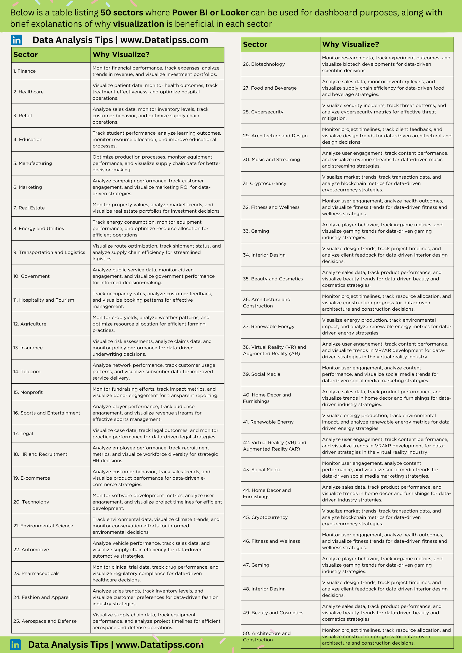
Unlocking Insights: Data Visualization Across 50 Sectors
In the dynamic landscape of data analytics, the power of visualization cannot be overstated. The ability to transform raw data into compelling visuals not only enhances understanding but also drives informed decision-making across diverse industries. In this blog post, we explore the vast applications of data visualization using powerful tools like Power BI and Looker,…
Managerial Economics: A Comprehensive Quiz 2024
Introduction Welcome to a journey through the intricate landscape of managerial economics! This blog post presents a challenging set of 100 multiple-choice questions (MCQs) designed to test and enrich your understanding of key concepts. Whether you’re a student diving into the world of economics or a seasoned professional brushing up on fundamentals, this quiz is…

Fetching Stock Prices from Yahoo Finance using Power Query in Power BI 2024
Are you keen on tracking historical stock prices in Power BI? Leverage the power of Power Query to seamlessly fetch and analyze stock prices from Yahoo Finance. This blog post will guide you through a step-by-step process, providing a convenient Power Query code snippet that you can integrate directly into your Power BI reports. Fetching…
Understanding Economic Indicators: A Comprehensive and Easy-to-Follow Explanation
Economic indicators are statistics that measure the performance, health, and direction of an economy. They can help investors, policymakers, businesses, and consumers make informed decisions about their economic activities. There are three types of economic indicators, depending on their timing: leading, lagging, and coincident indicators123. Leading indicators signal changes before the economy as a whole…