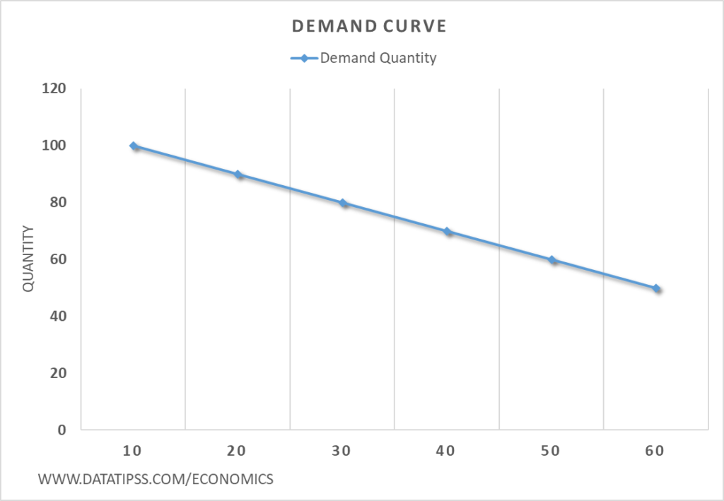
Demand Curve in Excel
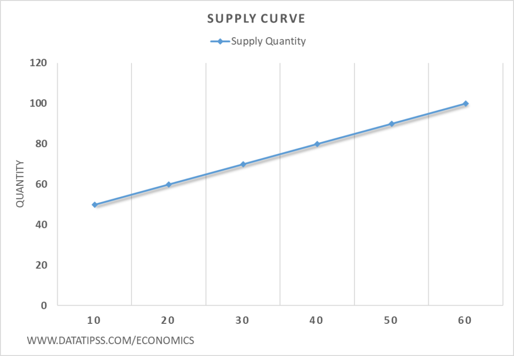
Supply Curve in Excel


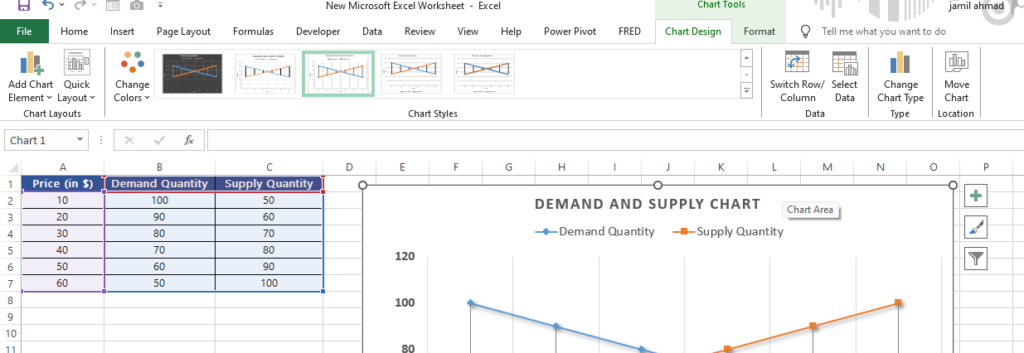
Description of the Chart:
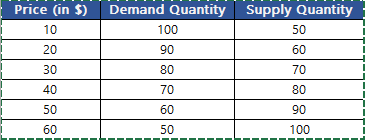
The demand and supply chart illustrates the relationship between the price of a product or service and the quantity demanded and supplied in a market. In this chart, the demand curve represents the quantity of a good or service that consumers are willing and able to purchase at different price levels, while the supply curve represents the quantity of the same good or service that producers are willing and able to supply at different price levels.
As the price of the product increases, the quantity demanded generally decreases, resulting in a downward-sloping demand curve. Conversely, as the price increases, the quantity supplied generally increases, resulting in an upward-sloping supply curve. The point at which the demand and supply curves intersect represents the equilibrium price and quantity, where the quantity demanded equals the quantity supplied.
Method to Create the Chart in Excel:

- Enter Data:
- Input the price and corresponding demand and supply quantities into an Excel spreadsheet. Place the price values in one column, the demand quantities in another column, and the supply quantities in a third column.
- Select Data:
- Select the range of cells containing the data (including the price column, demand quantity column, and supply quantity column).
- Insert Chart:
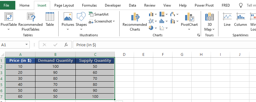
- Go to the ‘Insert’ tab on the Excel ribbon.
- Click on the ‘Insert Line or Area Chart’ button and choose the ‘Line’ chart type.
- Select the ‘Line with Markers’ chart subtype to display both lines with data points.
- Customize Chart:
- Right-click on the chart area and select ‘Select Data’.
- Click ‘Edit’ under ‘Horizontal (Category) Axis Labels’ and select the range of cells containing the price values.
- Adjust the chart title, axis labels, legend, and other formatting options as desired to improve readability and clarity.
- Add Chart Elements:
- Consider adding a title to the chart describing the relationship (e.g., “Demand and Supply Chart”).
- Label the axes clearly, indicating the price and quantity.
- Add a legend to distinguish between the demand and supply curves.
- Analyze and Interpret:
- Analyze the chart to identify the equilibrium price and quantity, where the demand and supply curves intersect.
- Interpret the relationship between price and quantity demanded and supplied, noting any shifts or movements in the curves.
By following these steps, you can create a demand and supply chart in Excel to visually represent the relationship between price and quantity in a market.
Leave a Reply